I’ve lost track of when I made the switch to Home Assistant. I think it was sometime around September or October 2025. The reason for this forgetfulness is likely because my HA has been running along without any problems for long enough that it doesn’t come to mind as a topic. Now that it’s in a position where it automates most of the house’s usual routines, with human interaction only happening occasionally to adjust the thermostat or a room’s lighting, it has taken the backseat as a hobby. This was always the goal. As much as I might enjoy perpetually modifying the userside interface, it needs to remain in a mostly stable arrangement for the other people in the house.
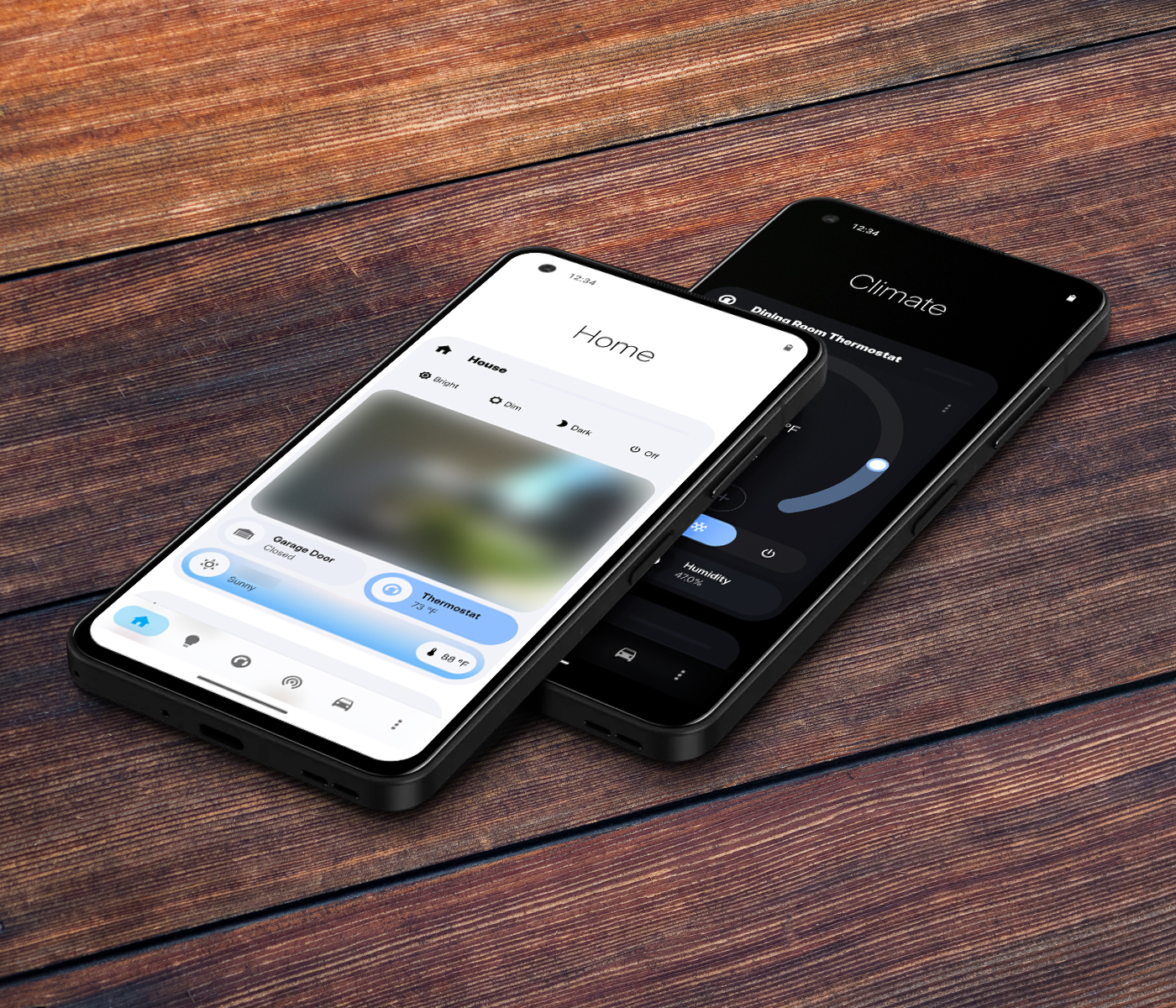
The initial screen begins with shortcuts to house-wide lighting automations (though these rarely need to be used), a live feed of the doorbell camera, and a few simple sensors for the garage, house climate, and local weather. Below that is a quick display on family members and a weekly calendar. Beyond this, there are other screens for granular lighting controls, climate control, and appliances in the house.
The top of every page has a bit of empty space to make up for the fact that smartphones today are enormous and users can’t reliably reach the top with their thumb. (Even the developers of mobile operating systems know this. Why else does Android’s settings page begin with so much empty real estate.)